
Color psychology studies how different shades affect our emotions, moods, and even behavior.
Understanding the psychological effects of color can help you make informed decisions and choose the best color palette for your home. This article delves into the fascinating world of color psychology and offers practical tips for choosing the ideal color for any room.
Power of Warm Colors:
Warm colors such as red, orange and yellow are known to have an exciting and energizing effect. It is ideal for social spaces such as living rooms and dining areas, as it can create a sense of coziness and intimacy. However, be careful not to overuse red as it can evoke anger and intense emotions. Instead, opt for softer shades like coral or peach for a more inviting vibe.

Tranquility in Cool Colors:
Cool colors such as blue, green and purple have a calming effect on our mind and body. It promotes relaxation and calmness, making it ideal for bedrooms or rooms where you want to relax. Lighter shades of blue create a sense of spaciousness, while deeper shades like navy create a more sophisticated look. Reminiscent of nature and regeneration, green is perfect for bathrooms, home offices, and anywhere else you want to freshen up.

The Neutral Ground:
Neutral colors like white, gray and beige create a versatile and timeless base for any room. It is balanced and can be combined with both warm and cool tones. Neutral tones work well as backgrounds and can add pops of color through furniture, accessories, and artwork. Plus, you have the freedom to change the decor over time without having to repaint the entire room. Set accents with strong colors.
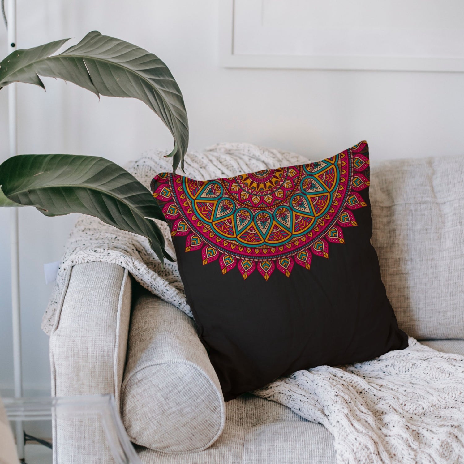
Bringing bold colors into your home adds visual interest and makes a strong statement. Choose accent colors that work for you to match the overall mood you want to create. For example, bold red and yellow accents can add energy to a neutral space, while deep purples and emerald greens can create a sense of luxury and sophistication. Use bold colors sparingly in areas such as walls, furniture, and decorative elements.

Consider lighting:
Keep in mind that lighting can have a big impact on the color impact of a room. Natural light brings out the true colors, so it's important to consider the window orientation and size when choosing a color. North-facing rooms tend to receive cool light, while south-facing rooms are filled with warm, bright light. East-facing rooms receive morning light, softening the colors. West-facing rooms, on the other hand, receive warm afternoon light. To ensure that your chosen color looks best in different lighting conditions, consider the following factors:
Personal association:
The psychological impact of color can also be influenced by personal experience, cultural background, and personal preferences. Consider your own associations with specific colors. For example, if blue reminds you of a serene ocean view from an unforgettable vacation, incorporating shades of blue into your home can evoke positive emotions and a sense of calm.
Harmonizing the Palette:
When choosing colors for your home, it's important to consider the overall harmony and flow from room to room. Choose a consistent color scheme or a complementary palette that ties different spaces together. This doesn't mean that every room should be the same color, but that there should be unity and balance. To achieve this, use variations of the same color family or choose colors with similar undertones.